
Explore the 10 greatest Drew Struzan sci‑fi movie posters that defined cinematic art, showcasing his iconic style behind classics from Star Wars to Blade Runner.
You’ve likely seen some of Drew Struzan’s artwork before, as he passed earlier this week at the age of 78. Struzan’s eternal artistic talent has produced some of the most well-known movie posters ever during the last nearly four decades, depicting classic after classic.
We’re honouring his legacy by reminiscing over his career, which is full of all-time great contributions to sci-fi movie history.
10. Cocoon (1985)
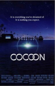
Why it’s great: Subtle yet intriguing. Struzan blends human emotion with alien mystery, using warm, luminous colors to suggest otherworldly energy. It balances sci-fi elements with heartfelt storytelling. Subtle, warm, and mysterious. Evokes emotion and curiosity, though less instantly recognizable than Struzan’s blockbuster hits.
9. Blade Runner (1982)
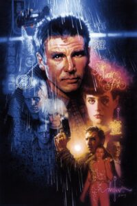
Why it’s great: Moody and atmospheric, reflecting the dystopian noir tone of the film. Struzan’s use of dark cityscapes, neon glows, and layered composition conveys both the futuristic setting and the film’s existential themes.
In 1982, Struzan was asked to paint some concept posters for the film, but they were never used. When Ridley Scott released a director’s cut of the movie in 2001, he decided to use the original designs for the DVD cover.
8. Back to the Future Part III (1990)
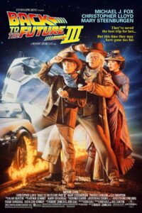
Why it’s great: Struzan shifts from sci-fi to western sci-fi without losing energy. Trains, horses, and the DeLorean all converge dynamically. The warm tones evoke the Old West while maintaining the franchise’s adventurous spirit.
For the third poster in the Back to the Future trilogy, Struzan plays off the strengths of the previous posters. Marty stands with Doc behind him, and both are looking at the time. But instead of using wrist watches, they’re looking at pocket watches. It’s wonderful, but without the other posters, it doesn’t really stand on its own. He often said the three are part of a single illustration.
7. Star Trek: The Motion Picture (1979)
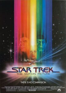
Why it’s great: Majestic and cosmic. The Enterprise streaks into the unknown, emphasizing exploration and adventure. Struzan uses bold lighting and color gradients to evoke wonder and grandeur, fitting Star Trek’s spirit.
6. Back to the Future Part II (1989)
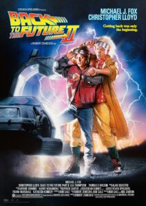
Why it’s great: This poster introduces a futuristic cityscape with neon lights and hoverboards, immersing viewers in 2015 Hill Valley. The composition cleverly layers past, present, and future, giving the poster a sense of time-travel chaos. Notably, while the first poster has a single person, the second has two.
5. The Thing (1982)
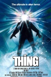
Why it’s great: Dark, tense, and chilling, the glowing, distorted figure of the Thing in the Arctic isolation evokes a sense of horror and suspense. Struzan’s poster perfectly conveys the paranoia and fear central to the film. There are no faces in the poster. Instead, it relies on a single hooded figure. Is it an alien or a person? That’s the central question in the film.
4. Star Wars: Episode VI – Return of the Jedi (1983)
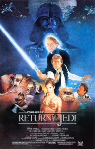
Why it’s great: The poster captures the ensemble cast and stakes of the film. Struzan blends characters with key scenes—like lightsaber duels and the battle on Endor—giving it cinematic drama and depth. There’s a lot going on, but it focuses on the central conflict of Luke vs. Vader.
3. Back to the Future (1985)
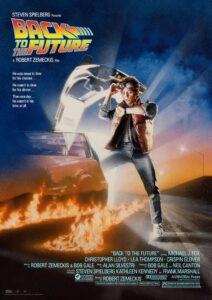
Why it’s great: Struzan captures both the fun and the wonder of time travel. The fiery DeLorean tracks create motion, and Marty’s expressions convey urgency and excitement. The illustration has a perfect balance of realism and stylized energy.
2. E.T. the Extra-Terrestrial (1982)
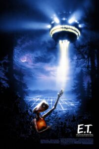
Why it’s great: Iconic for its simplicity and emotion. The silhouetted bike flight across the moon captures awe, wonder, and intimacy. Struzan’s composition makes the alien-human connection feel magical and timeless. One of the best illustrations of what made the artist’s work eternal is the E.T. poster, which evokes romantic nostalgia and wanderlust with each brushstroke.
1. Star Wars: Episode IV – A New Hope (1977)
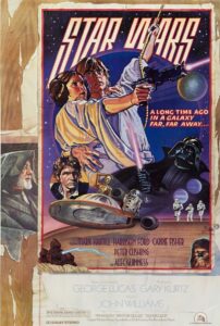
Why it’s great: Struzan balances action and character focus perfectly. Vader looms menacingly, while Luke, Leia, and Han are positioned to highlight their heroism. The style and layout perfectly capture the tone of old movie serials. The 1977 Star Wars poster, created by Charlie White III and Drew Struzan, was created for the movie’s summer re-release. Nicknamed the “Circus Poster,” George Lucas often referred to this as his favorite until the “Special Editions.” Speaking about the original creation, Drew said, “When we got the billing, we discovered there wasn’t enough room for all the credits, so we had to figure out a way to make more space. We thought, ‘Why don’t we take what we already have and paint it to look like its wild posted on top of other posters?’ That gave us the extra room we needed for the billing at the bottom. It was a case of Necessity being the Mother of Invention.”While the artist created dozens of posters for the movies, this stands alone as the most unique and stylistic of the series.
Which is your favorite movie poster by Drew Struzan? Let us know in the comments below!
Discover more from The Geek Twins
Subscribe to get the latest posts sent to your email.