 |
| Source: LucasFilm |
Did you ever notice what the user interfaces were like in Star Wars? I’m guessing, probably not. You were probably more interested in the lightsabers and spaceships and aliens flying around. But one person was really focused on the UI: Dino Ignacio.
Ignacio is a legendary designer of UI for videogames, including Dead Space, Dante’s Inferno, Dead Space 2, and Dead Space 3. He’s currently the User Experience Director of Visceral Games at Electronic Arts, so he’s very interested in how people interact with machines. In an interview, he said:
I was interested in UI even before I knew what it was called. I remember growing up watching movies like The Last Starfighter, Blade Runner and Star Wars and fixating on the computer screens and the graphics on them.
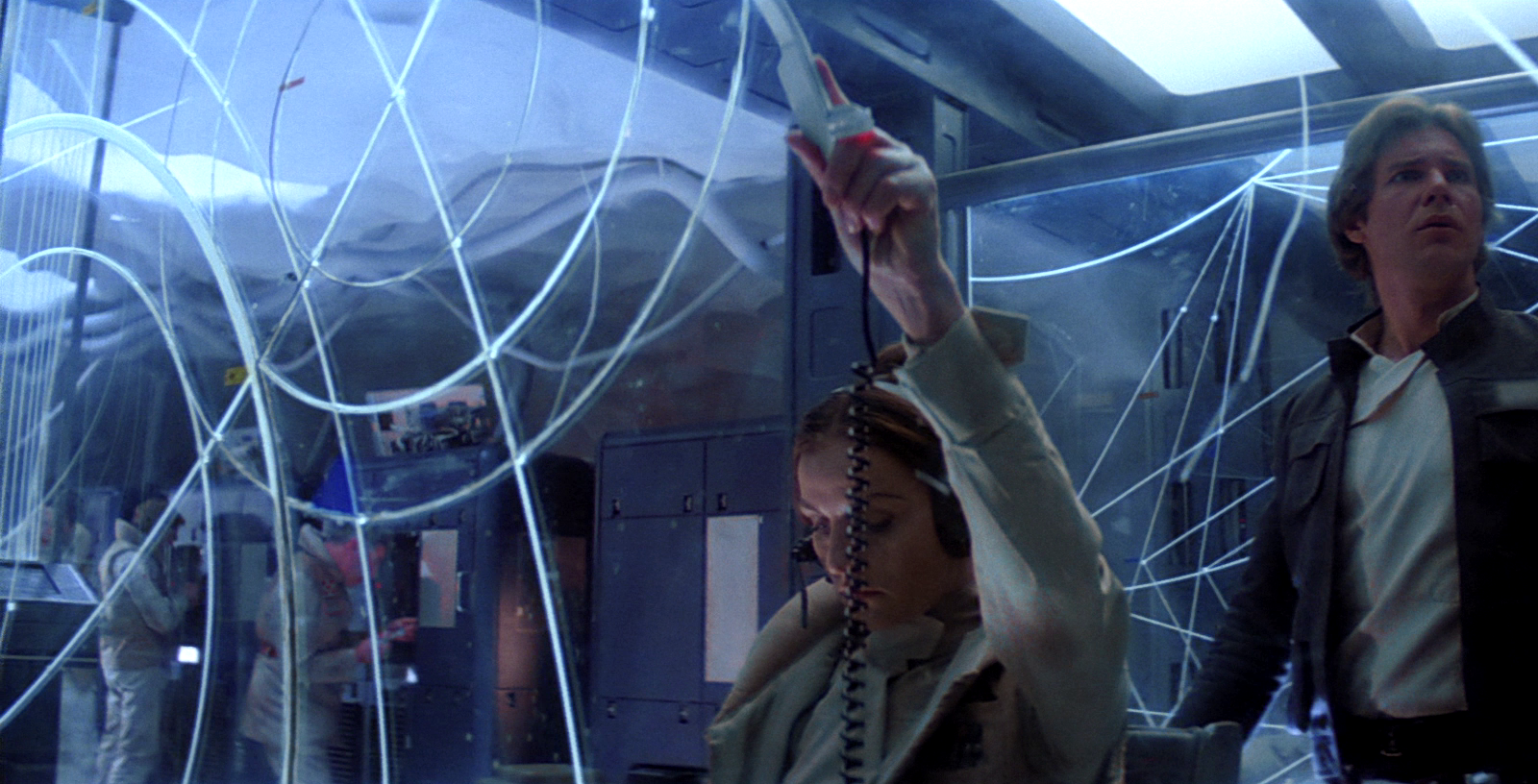
To illustrate this obsession, Ignacio decided to put together a supercut of every time anyone in the original Star Wars movie interacted with machines in any way. That included computers, robots, doors, and screens. What you get is a lot of levers, knobs and buttons. What was futuristic in the year 1977 isn’t quite as futuristic in the year 2015.
The Interfaces of Star Wars: A New Hope from Dino Ignacio on Vimeo.
[Via Gizmodo]
What do you think of the Star Wars UI?
If you enjoyed this, then please use the buttons below to tell your friends about this post! Follow us! Email | RSS | Twitter | Facebook


<span class="dsq-postid" data-dsqidentifier="33715 ">2 Comments
Fewer knobs now, more touchscreens.
It's like looking back at the computer in War Games. So out of date.
If GL still owned SW then we might have had the ultimate UI upgrade in the new, new, new, new versions of the OT. He could digitally change every aspect to meet todays standards in technology.